We've had a glow up!
22/06/2026
A new logo and a fresh lick of paint for our website.
After two years of using a logo we'd thrown together ourselves, we knew it was time for a change. We wanted something that truly reflected who we are and what we do, but we also knew that getting there would take a professional touch. We were recommended Anna Patience, and couldn't be happier with her work!
She helped us with far more than just the logo, and this post showcases all of it.
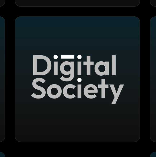
The logo and icon
→
↓
Previously, we used the same image for both our icon and logo. Now we have a proper logo with variations (more on that below) and a distinct icon. And we think it works on so many levels.
The design is minimal and professional, yet full of meaning. Connecting the dots is what we do best: understanding complex domains and building effective digital solutions within them. And in the wider sense, technology can enable and bring people together into a digital society
, if you will.
New website design
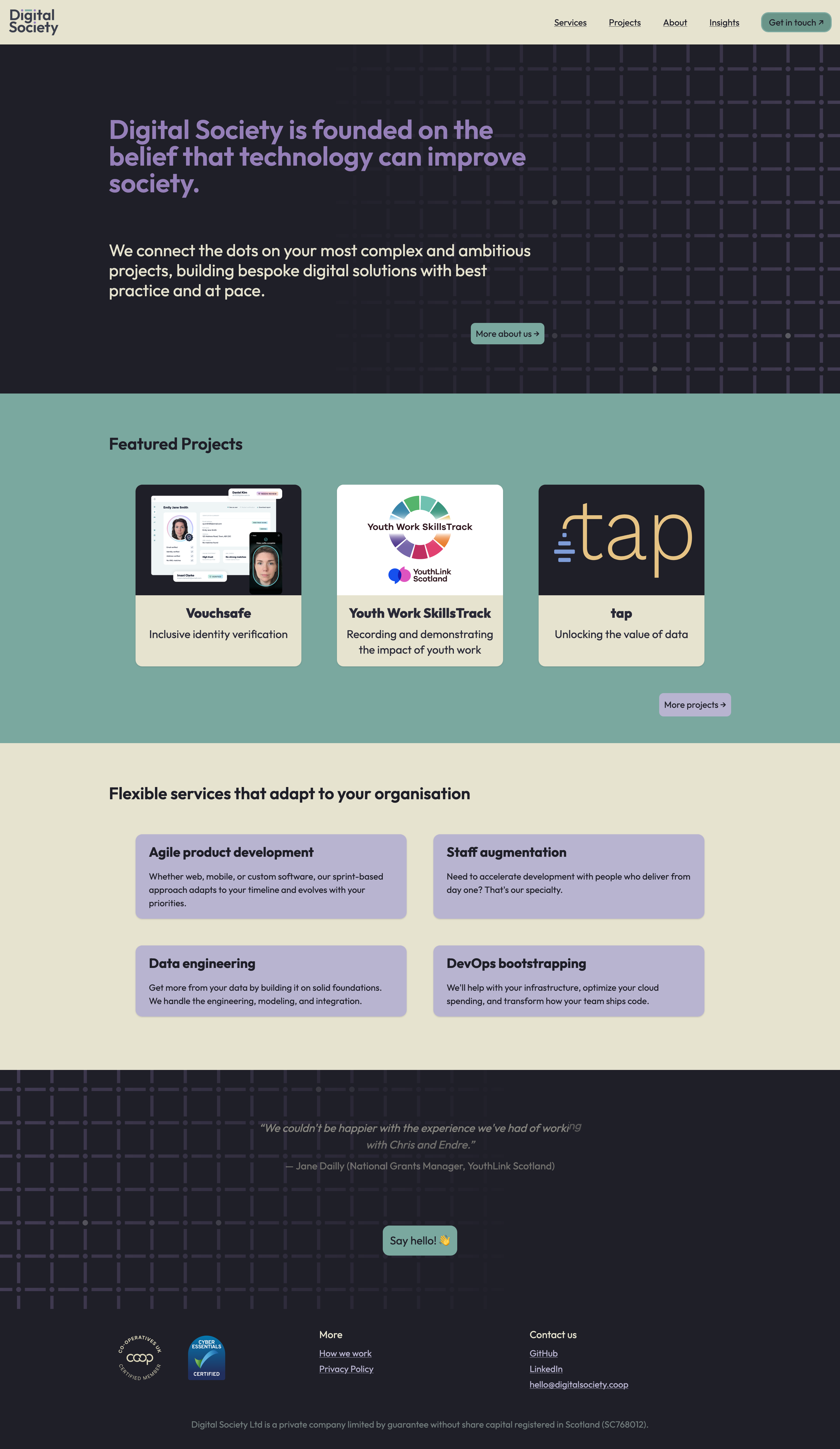
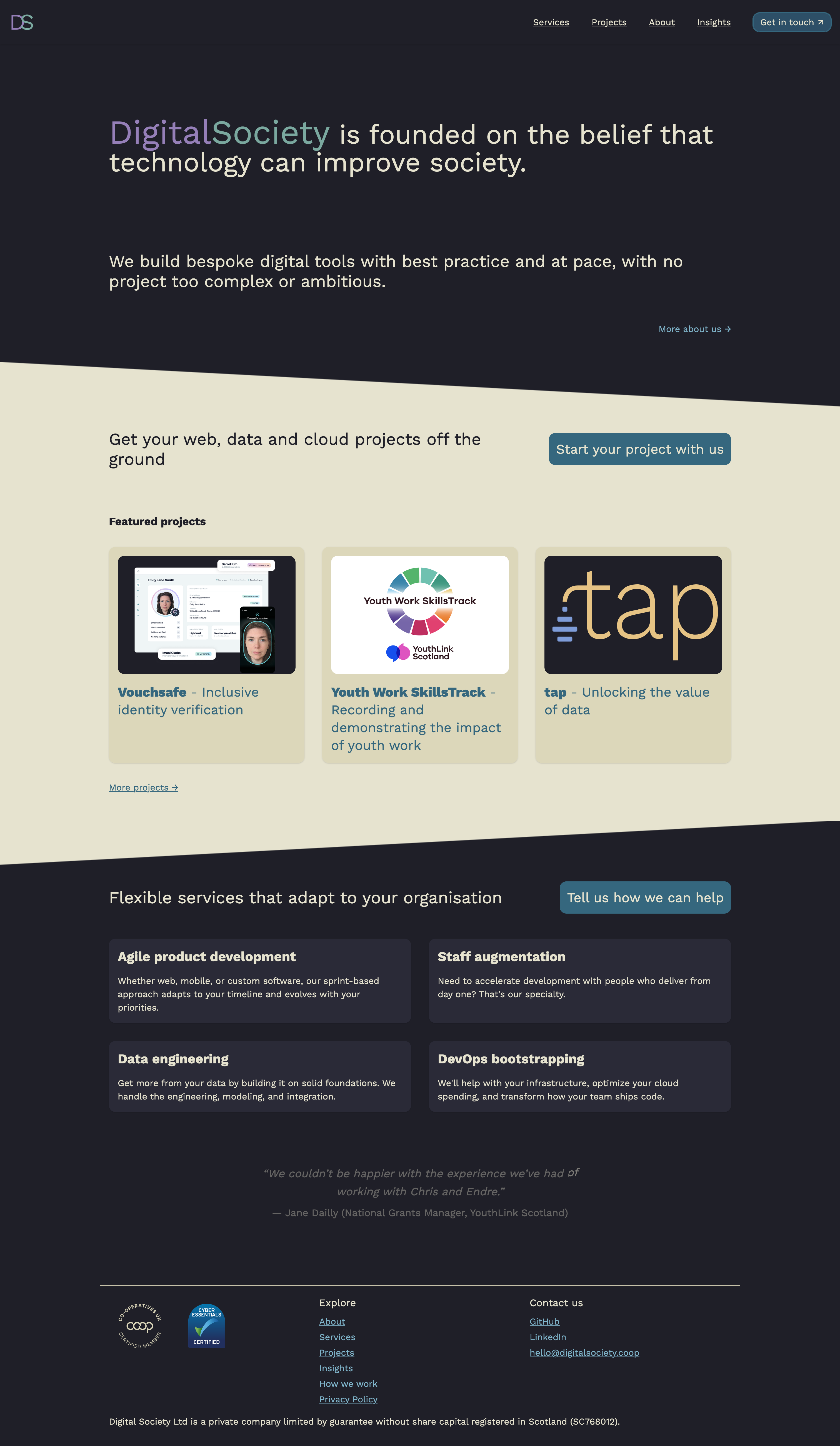
We are now using a shiny new font (Outfit), the existing colour palette more playfully and have a jazzy new background, all based on a helpful brand summary Anna gave us.
Logo variations
We also wanted a logo that has our full URL (to make us easier to find), which would be ideal for print, and a logo we can use on our other estates (such as epcdata.scot).